Designing a New Console Date Range Picker - A PayPal DesignOps Case Study
November 2020
The following is a sanitized reprint of an article I wrote for the internal PayPal Tech Blog in late 2020 after completing the design exercise. The article delves into the effort involved in researching, testing, and designing a new Date Range Picker UI control for the internal Developer Console, a federated DevOps platform that I worked on with the UX team for the Developer Tools and Platform Experience (called "TPX" at that time). Note that each of the Console's tools modules is called an "Extension".
I frequently posted on the internal PayPal Tech Blog for several reasons, including helping develop a sense of "Design Thinking" among technical colleagues, to be more transparent in the amount of work and thought that goes into the UX design process, and of course to grow my own personal reputation as a design though leader internally.
One of the "funner" aspects of UX design is the occasional opportunity to design something new from the ground up. Though more often than not, there's a lot of great inspiration out there just a Google search away offering hints as to which strategies may be more (or less) successful than others.
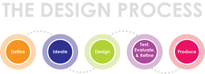
The good news is that we have guideposts to help us on any design journey, whether we're starting from scratch or iterating on an existing product. There are many ways to model the product design process. In this DesignOps case study, we'll be following this roughly 5-step process.
Courtesy of Adlai E. Stevenson Tech Ed Program
The Assignment
In August, the TPX UX team lead, Erica Rider, asked me to design a new date rangepicker for use in Console Extensions. Selecting a range of dates to filter a report or dataset is a very common use case, and she wanted to see what we could do to design an easy-to-implement solution for engineers that would also be easy-to-use for our users.
Because our UI control library (Microsoft Fluent) doesn't offer a stock date rangepicker UI control, the risk is that each extension team would create their own solution, which would result in jarring, uneven experiences for customers. Plus, as anyone who's ever worked with dates knows, dates are complicated objects with their own weirdnesses that are minefields with random hidden bugs.
In addition, Erica wanted to see definitions for a consistent way to display timestamps, with an option to format timestamps in a "social" way. In the current era of social media, users are familiar with seeing "about 5 min ago" instead of exact hour and minute values, such as "3:45 pm." However, Erica and I wanted to get feedback on not only how much appeal social timestamps would have, but also how to display them in a useful way in a corporate enterprise context.
Exploring Prior Art
The first thing I like to do when starting a new concepting project is see what's come before. By seeing what others have already done, we can get a great sense of the range of solutions others have already tried and settled on. Because design is not only about exploring a solution space but also about optimizing trade offs, it's fun to reverse engineer what the likely use cases were that drove another team to create specific solutions.
Southwest.com Date Range Picker (left) and PayPal.com Date Range Picker
Date Range Shown in the Calendar
One common feature between both the consumer PayPal-style and Southwest pickers shown above is the ability for the user to select a start and end date, and view both plus a colorful bar in between them representing the range. This is a common feature available on many web sites nowadays, and works especially well for date ranges that are typically of a duration within a few weeks.
Notice how the PayPal consumer date picker has a single Calendar month shown at once, which works great for short durations, while the Southwest picker shows two Calendar months side by side with sequential months. The latter approach works well for durations in the 1-8 week range.
For this project, our first restricting limitation was purely technical: The Microsoft Fluent Calendar control cannot show a range of dates inside an instance like the two illustrations above. The control simply doesn't support such a concept, and it would be too difficult and costly to attempt to create a variant of the control that could.
The second potential issue was that in enterprise use cases, date ranges can span multiple months, such as "Jan 1 - Jun 30." As a result, it would be more efficient for enterprise use cases to offer two Calendar controls on the same popup, de-coupled so that they can show non-adjoining months like January on one, and June on the other.
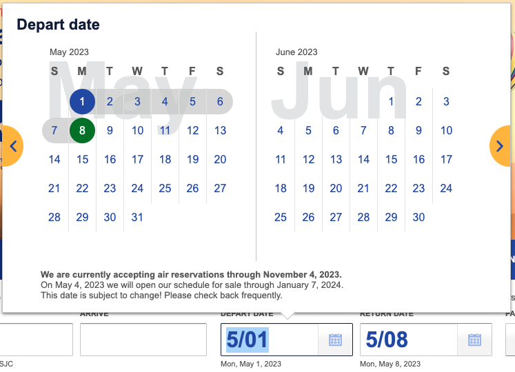
Southwest.com Date Range Picker illustrating how 5/01 is interpreted
Formatting Selected Dates
How to format the selected date range is also a big consideration. In both the PayPal-style and Southwest UIs, we notice a few things:
- - Two Buttons: Both offer two buttons, one each for triggering the start and end date selection.
- - U.S. Short Form: Both also display their selected dates in the U.S. short style where "5/1" represents "May 1" rather than "January 5." This style is only commonly used in the U.S., and can cause interpretation issues outside the country. (We don't know if these controls adapted the short form display according to the browser's culture/region settings.)
From the UX team's perspective, though, we wanted to see a single UI control that could be implemented easily by a developer, with all of the date range picking and date formatting features built in.
From the UX team's perspective, though, we wanted to see a single UI control that could be implemented easily by a developer, with all of the date range picking and date formatting features built in.
In addition, here is where we both wanted to see a standardized world-friendlyformatting for the selected dates to make life easier for all of our colleaguesworldwide, rather than an American-centric format like those shown above. This isalso where Erica wanted to see the optional display of social timestamp formatting.
Adding Time to the Mix
When looking at the use cases within TPX, it was clear that the same control would need to support being able to optionally pick times along with the start and end dates. For example, in some of our logging systems, each minute can have many megabytes' worth of data. So it's critical in that use case for the user to be able to choose a very short time range, perhaps just 5 minutes total -- not 5 days!
And of course, Erica reminded me that it still had to be easy to use with as little complexity as possible for end users (and Extension developers).
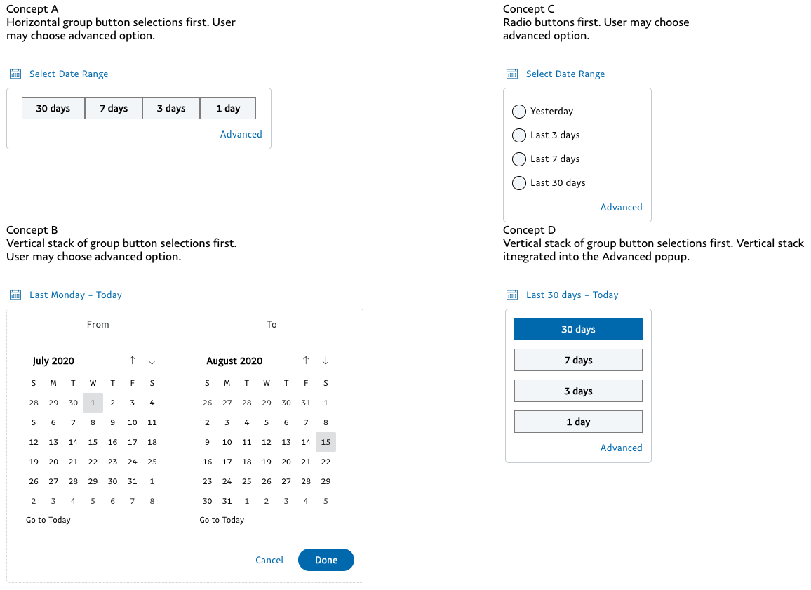
Screen capture of 4 early date picker concepts expanded
Early Concepts
Using UXPin to mockup these concepts with actual Microsoft Fluent UI controls, I created four early concepts for the Date Picker control. When collapsed, they all represent on the page as a single button -- easy for an Extension developer to implement.
Clicking on the button displays a simple popup showing Quick Picks, configurable by the developer. Each of the 4 concepts shows a different presentation for the Quick Picks as horizontal or vertical group buttons, or radio buttons. After the user makes a selection, it disappears and shows the selected date range.
Each concept offers a way to show the full Calendar selection UI by clicking on an Advanced option. The Calendar UI presents two Calendar controls which allow the user to easily choose arbitrarily large date ranges of months or years.
Once a date range is selected, the popup disappears and displays a date range in either the traditional long format or social style, also developer configurable.
As you might imagine, these concepts optimize for the Quick Picks experience, witha subtle assumption that Quick Picks are more commonly used than the calendars.
User Discovery: When Things Don't Go Well, But in a Good Way
After creating the first batch of rich interactive prototypes in UXPin (with lots ofcomplicated scripting), I scheduled interviews with a half dozen developers and product managers in TPX. My goal was to get general feedback from each person both as a user and as an engineer / product manager. In the latter case, I was hoping to hear how people would want to customize the UI controls and what kinds of usecases they worked with.
In a nutshell, I got poor feedback. And I mean that in a good way!
The first couple of feedback participants were lukewarm at best to my initial design concepts. They recommended I take a look at the pickers used by Kibana and one of our own internal tools, which pointed me in a new direction. And that's exactly what I needed to do.
Next, I created a new concept based on the internal tool's picker, taking into account our UX goals, and scheduled additional interviews.
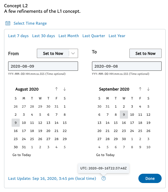
Refined concept based on the proprietary internal tool's implementation
PayPal for the Win!
Everyone who saw the concept inspired by our internal tool preferred it to the the others -- with a few notes. Several folks said that the tool's two rows of Quick Picks was too much. In fact, they had a preference for 5 or fewer Quick Picks on the same line, and that's it.
One developer asked for what will likely be a very valuable feature. In the text input field where one can type in a date and optionally a time, he asked if users could paste in a server timestamp. He said that users of his systems typically see timestamps in a certain server format in their logs. Currently, they need to use a web tool to convert those server-formatted dates to a standard human-readable format. That was a fantastic idea with a very clear and compelling value.
Whose Time Zone?
Among lots of other great feedback I heard, another consistent topic people asked about was: What time zone was being used for filtering and formatting output? Is the time shown San Jose time, UTC, or adjusted into my local time zone?
For a global company, this is an excellent question and can have a real impact whenit comes to such wide ranging use cases as debugging to reporting. And unfortunately, internal systems within TPX have historically been inconsistent and non-obvious.
The Final Design
Again using UXPin, I documented the UX requirements and created a rough prototype for the final design of our UI control. I wanted the control to be easily configurable by the developer with modular features that could be turned on or off, while removing as much complexity in dealing with date objects as we could. Some feature highlights:
- - Configurable set of Quick Picks
- - Date-only durations supported
- - Durations where time matters supported: Such as high volume, micro-second-based incident datasets
- - Whether to show resulting selections using "social time" formatting
- - Graceful date/time displays using opinionated formats
- - Higher developer efficiency with copy/paste support
- - Formatting for local time zone by default (based on browser settings), optionally allowing user to easily switch to UTC
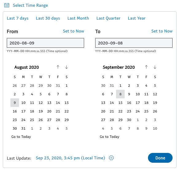
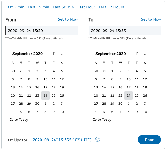
Final Date Range Picker Variants: Dates Only with Button, Dates + Times (Popup), Quick Picks Only (Popup)
Modular Features
In addition to documenting the features of the full control, it's important to also illustrate how the control could be embodied with a few of the optional features enabled or configure differently. Not only does this help stakeholders imagine how the control could support a variety of use cases, but it also helps the engineer who actually builds the control to imagine what they need to do to enable each option.
For example, PayPal has many use cases where the user needs to select a time range that might be 5 minutes or less. Example B to the right illustrates how the developer could make a few adjustments to the control to optimize it for such a use case.
- - Quick Picks: Set appropriate display text and ranges for each.
- - Input Fields: Pre-populate with most recently updated time (To) and previous 5 min (From).
- - Calendars: Both set to current date.
- - Dataset Last Updated Timestamp: This shows how recently the current dataset was last updated. In this example, we illustrate that the user has set itto show time in UTC rather than local time.
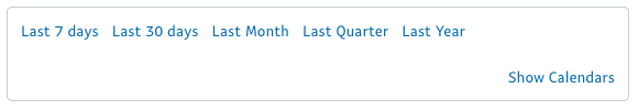
Similarly, in Example C, we show that this control should support the ability to show Quick Picks in its initial state, optionally allowing the user to "Show Calendars" to seethe full UI.
The Example C design came from the user discovery effort. Some developers and product managers liked being able to show this quicker UX for some of their use cases.
It was also noteworthy that they were generally not fond of the label "Advanced" for showing the popup's full UI. The label "Show Calendars" was preferred.
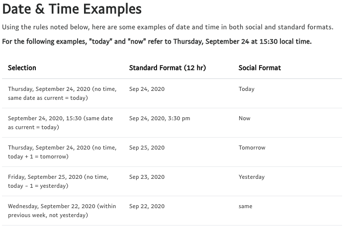
Date Formatting Utility: Formatting Tests (Partial List)
Opinionated Date & Time Formatting
Erica was insistent that the selected dates be formatted in a more "human-centric" way with optional social formatting. But how do we translate that high level goal into something that can be codified into an API and tested against?
And given the high level of variability of date and time displays around TPX, it was clear that a simple utility that could consistently format Date objects according to a UX standard for the Console would be extremely useful.
Regarding social formats specifically, I also heard in the discovery process that rendering "Nov 9, 2020" as "Last Monday" could be confusing as the customer would need to do that translation in their head. However, simple social formatting for "yesterday," "today," and "tomorrow" ought to be fine, as long as it was an optional setting in the control's API. Excellent! We could work with that for sure.
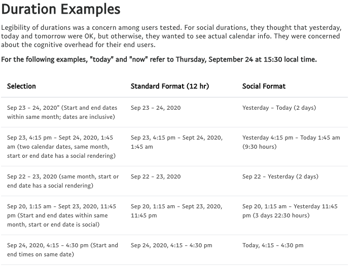
Date Formatting Utility: Duration Tests (Partial List)
Formatting Time Durations
When we think about formatting a date, we typically think about formatting just a single date, such as "Nov 9, 2020." With this project, we're also proposing standards for formatting a range of dates, such as "Nov 1-9, 2020" or "Sep 1 - Nov 9, 2020," as well as standardized formats for durations of minutes or hours.
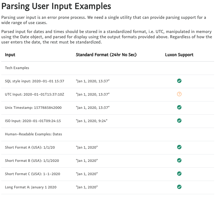
Date Formatting Utility: Input Validation Tests (Partial List)
Parsing Date and Time Inputs
Last but not least was setting standards for parsing input. Parsing and validating user input in a secure manner is consistently one of the most difficult and error-prone parts of any UI implementation. This new date range picker UI control will have all of the parsing and validation built in -- the Console developer won't have to do anything to support robust date and time options.
Next Steps
As I've illustrated in this case study, I followed a common design process model to define initial requirements and user hypotheses, explore what other smart people had done before me, concept, test and refine. Console stakeholders have already reviewed the design proposal and approved it. The final step is to produce it.
As of October 2020, we've placed two deliverables in the queue for the Console engineering team:
- - The Date Range Picker UI control
- - A separate Date Input Parsing and Output Formatting Utility
The Console engineering team's queue is quite long, but we expect wide availability sometime in Q1 2021.
In the meantime, you are more than welcome to review the complete Date Range Picker UI Requirements for yourself. If you have thoughts on how we can make this design better, please send me a note on Slack or email.